
Art invitation: color + composition boards

I started when I was nine. Really everything I know about color theory, composition, drawing and painting, I learned when I was a kid.
- David Salle

You know those ideas that start out as teeny tiny buds and then somewhere in the process of unfolding, you realize you are bowing before a mighty oak? This invitation is one of those. The idea tree grew on a Tuesday afternoon. I had spent the day trying to get work done but I was utterly distracted by this vision of an art invitation that I wanted to try with my girls when they got home from school. The idea was simple: Give them each a white foam core board and ask them to go on a color hunt in our home. The only directions I gave them were to find 5 to 20 items of the same color that were small enough to fit on their boards. Off they went scraping the bottom of their toy baskets, rummaging through the "shove it drawers", scanning the book shelves, grabbing items from the studio, and taking a bit from here and there. I uttered a few guide words ("what's leaping out at you?", "look in unusual places", "maybe you take a piece of an item but not the whole thing"), but other than that I just left them to it. "Mom, what if I find something I really love but it's not red?" "Save it and start making another color collection", I said.
The hunt was a beautiful thing to watch. There was zero bickering, total focus, and generosity was flowing... "Here, Ri... I found you a pretty green pencil." I watched as each of them lovingly curated their collection, making edits and re-arrangements. "I think less is more with this one", Ri said as she arched over her "sea glass green collection" and removed some pieces. When we hit the 20 minute mark, I gave them a 5 minute countdown because I was afraid we would lose light and I really wanted to introduce the second half of the invitation. When I called "time" each of them had gathered enough items to create 2 color boards.
"Okay, now you are going to take a picture of your collection on my phone. What do you see when you look through the view finder? How can you make it all fit?" This is where things got REALLY interesting. H asked R to hold her "view finder" so that she could focus on moving her pieces around until they "looked right". In that moment, the color hunt organically grew into an elements of composition experience. H (age 6) was moving and grasping composition in a tangible way while Ri (age 12) observed and took mental notes. Meanwhile, the artist/teacher/proud mama was doing triple back flips inside watching all of this unfold. Listening, watching, throwing out the occasional art concept or vocabulary word. Some that stuck and others that flew right on by.
The girls were both fully present in the process. Take a shot. Change the angle slightly. Stand the toy up. Nope, it's better laying down. What a joy to see a big, foundational, art concept unfold through process.
I am hoping that we can build on this invitation and that part 2 will be drawing a still life of their photographs. Stay tuned!
If you want to try this process but you want to skip the screens, you can print out this paper view finder. The process will be the same, minus the capturing a picture part.

The 8 Elements of Composition in a nutshell:
Unity: Do all the parts of the composition feel as if they belong together, or does something feel out of place?
Balance: Balance is the sense that the piece "feels right". Having a symmetrical arrangement tends to provide a sense of calm whereas an asymmetrical arrangement can create an exciting feeling. You know when your art work just "feels off"? This is often the result of a lack of balance.
Movement: There are many ways to give a sense of movement in a work of art, such as the arrangement of objects or the flow of brush strokes.
Rhythm: In much the same way music does, a piece of art can have a rhythm or underlying beat that leads your eye to view the artwork from a certain direction or pace. Often times you will notice recurring colors and shapes when a piece has distinct rhythm.
Focus: The viewer's eye ultimately wants to rest on the "most important thing", i.e. the focal point in a piece.
Contrast: A strong difference between light and dark, or a severe difference in shape, color, size, and texture.
Pattern: A repetition of lines, shapes, and colors.
Proportion: How things fit together and relate to each other in terms of size and scale; whether big or small, nearby or distant.

H, age 6
The blue board was H's first collection. The coat placement happened in an instant and it did not move. I love how strong and defined it is. It anchors the composition. H took about 15 shots before she settled on this one. She would lay Cinderella down and then stand her up again. She went back and forth with the 3 blue blocks... she played around with stacking and finally decided that she preferred them like this. I love the vertical line of dark blue running through the center of her board. The coat, the tip of the kazoo, the deepest blue square block. My guess is that the ombre blue paint job on the ukulele directs the balance of shades we see on the rest of the board.
R, age 12
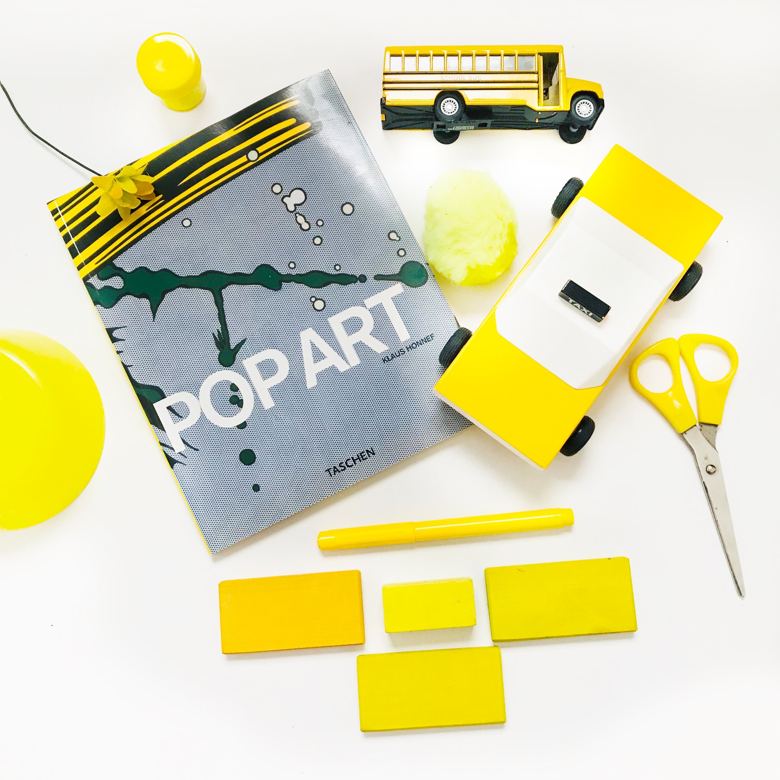
In this yellow composition everything is a little tilted... objects are stacked, the bright yellow is popping off the page, and our eyes are drawn to the words POP ART. The taxi cabs, the school bus. Doesn't it capture the feeling of a lively city street? Also notice the contrast between yellow and black. That contrast is repeated in the book cover, the taxi cab, and the school bus. Notice the dot shapes; scissor handle, fluffy pom pom, the lid on the paint jar, and the bowl turned upside down. It is energetic and exciting... it POPS!

H, age 6
When I asked H where she wanted my eye to land when I looked at her red board she said, "the donkey". Notice how the black type on the book cover and the black circle of the toy camera create balance. The circle shape repetition creates movement. My eye is drawn to the circle in the camera lens, the circle of the ball, the lollipop, the O in the scissor handle. Everything is pretty straight forward in the square, but then she throws a little visual interest into the mix with the tilted doll shoes.

R, age 12
This is a great example of how color can really convey a mood. There is a rhythmic and harmonious dance happening between the shades of color on this board. We go from deep sea green to light sea green and back again. I think Ri made a wonderful choice when she decided that "less is more". I love the balance of layering. First the boat on top of the book and then the watch on top of the block. This composition evokes calm, balanced feelings that one would find by the sea. The boat just seals the deal.

